E a t s y
Eating has never been more easy.
and fun.
Summary
Role
UX Researcher, Product/UX/Visual Designer
Skills
User Experience, Visual Design, Product Design,
User Research, Branding
Eatsy is a hypothetical app I designed as a personal project in order to explore and indulge in the journey of product design.
For 4 weeks, I collected and interpreted both qualitative and quantitative research, conducted various idea-provoking activities, synthesized key concepts, designed wireframes, and transformed all my findings and ideas into a finalized brand and its high-fidelity prototypes and mock-ups.
Timeline
October 2022 - November 2022
Tools
Figma, Adobe Illustrator
So… What does the app do?
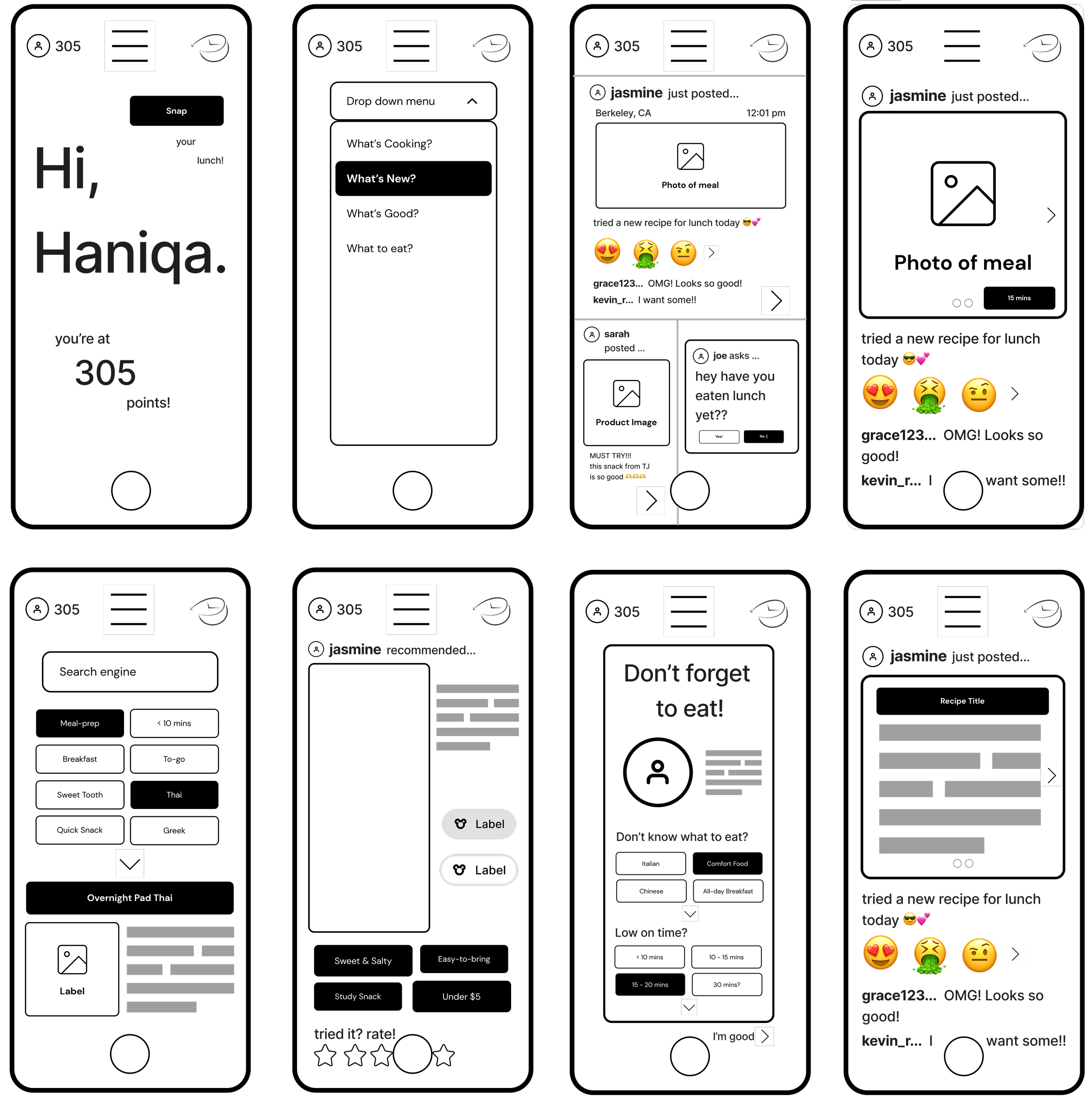
“What’s New?”
This page runs down all the new updates. It also includes a feature where friends can check on one another to see if they have eaten.
“What to Eat?”
This page allows users to search for their desired meal with the help of categories and recommendations based on their previous interests.
“What’s Cooking?”
This feature allows users to instantly capture or select an image from their camera roll of a dish, snack, or any other food-related thing they wish to share with their friends or everyone on the app.
P.S. The camera page is also accessible by tapping the white button at the bottom!
“What’s Good?”
This page allows users to view food recommendations from their friends and, if they choose to, others on the app. It also shows where to purchase the item and how to navigate there, the price of the item, a direct link to purchase the item online, and an interactive component where users can like, comment, send, and/or rate the product.
Background
Upon coming to college, I routinely encounter numerous comments and conversations from fellow peers about forgetting or disregarding meals, being too busy to eat, and/or not knowing what to cook. Being thrown into a new life of responsibilities and freedom, college students often struggle to hold themselves accountable for eating regular, nutritious meals that are within their price range and that do not take up too much of their already limited time.
According to Forbes, a 2019 study surveying around 167,000 students across the nation found that ‘39% of students at two-or four-year schools had experienced food insecurity’. This, along with other overwhelming statistics and unfortunate experiences, led me to the following question:
How might we make eating nutritious meals regularly fun, easy, and affordable for all college students?
Research
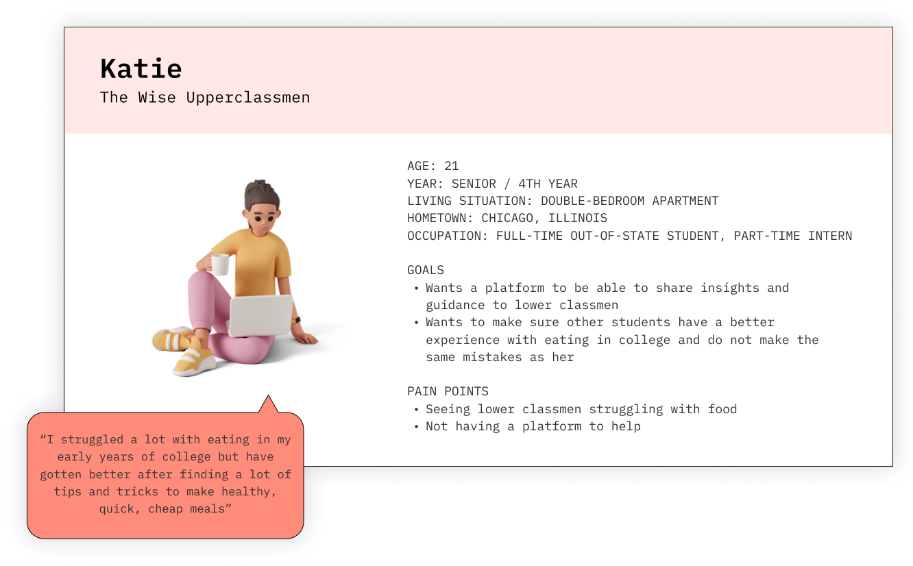
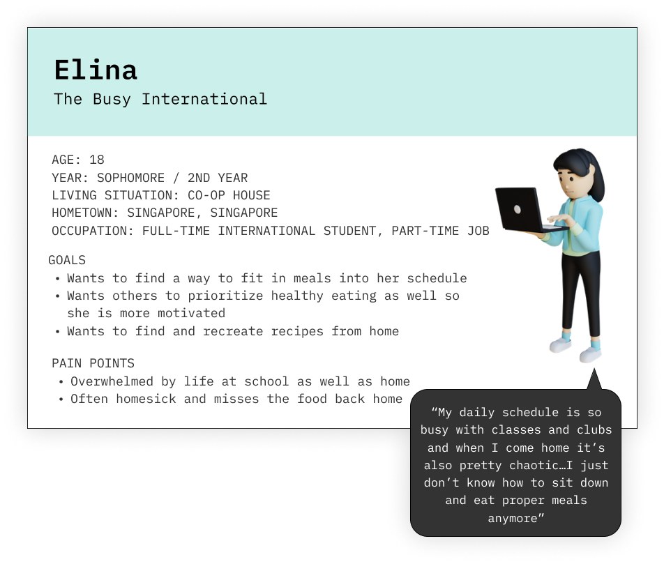
User Personas
User Personas
To better gauge the needs, thoughts, and feelings of the user, I conducted 7 interviews and released a brief survey to 40 people within my target audience.
“As much as I know nutrition is important for my health and stuff, I just don’t have the time and energy to cook with my super busy schedule on weekdays”
-Interviewee #1
Synthesis
“I am usually hungry but I just don’t know what to cook and I’m lazy to think…so I just end up snacking on something or just hold my hunger…I know it’s bad”
-Interviewee #5
“It’s just so hard to prioritize eating, especially healthy eating, with the chaos of college…you have to do everything yourself too which is hard when you’re used to being served food by your mom everyday in high school”
-Interviewee #6
From my research, I was able to conclude 3 key insights:
Most college students value nutrition but cannot implement it into their lifestyles
The issue is not being uneducated on the importance of eating on health, but the inability to find ways to tailor and weave it into busy and demanding schedules
The main reasons behind missed meals are a lack of time, effort, and money
Many students do not have nutritious meals or skip meals altogether due to financial constraints, not having enough time, or being too lazy and tired to prepare and eat food
Access to affordable, simple, and healthy meals is difficult for college students
Most college students do not know how or where to find meals that are nourishing, do not require much time and effort, and fit within their limited budget.
Based on the participants of my research, I developed 3 distinct personas that summarized the key characteristics, needs, and frustrations:
Ideation
Brainstorming & Affinity Mapping
I brainstormed potential features of the app that aligned with 4 key components that should be included based off of my research findings, user personas, and journey map: interactivity, competitiveness, information, and personalization.
LOW-FIDELITY SKETCHES
I then designed initial low-fidelity sketches and a user flow diagram based on the previously explored ideas and themes.
user flow
Prototyping
BRANDING
Before progressing with the prototypes for the app, I designed a logo and established the color scheme and typography of the brand. After brainstorming potential brand names, I decided upon one that combined two fundamental elements of my app.
I chose a light shade of purple and a bold shade of green as the primary colors. With purple’s connotations of wisdom and knowledge and green’s typical associations with health and vitality, these colors best represented what the brand stands for: maximizing nutrition through the sharing of insights and experiences.
Typography
Mid-fidelity prototypes
Eat + Easy = Eatsy
After sketching out initial ideas of what the app would look like and how it would be structured, I progressed to representing my ideas through mid-fidelity screens.
Usability Testing & Reflection
1. Keep it short and simple. ✔️
Users commented that if the way of displaying recipes is identical to the ones they can find anywhere online, the approachability and enjoyability of the app would be diminished. Hence, it is critical that the app is designed to keep instructions short and simple, perhaps by implementing a character limit for the ‘add steps’ portion of the posting page.
2. Limit camera button. 🚫
As useful as it could be to always have access to the camera page, users pointed out that there are particular spaces where having the button at the bottom is actually distracting and inconvenient. Hence, I should be more selective about where the camera button is present by recognizing where it is effective and where it would be better removed.
3. Personalized theme & avatar. 😎
Since one of the core foundations of the app is to make eating entertaining and individualized, users emphasized the need for food-related themes and avatars that the user may choose from and are tailored specifically towards their respective interests and preferences. When products are personal, users are more incentivsied to keep using them.
This was my first Product Design and UI/UX project but certainly not my last. I was able to learn by doing and I enjoyed every step of the way. Although Eatsy is hypothetical, I strongly believe and will continue to advocate for the fundamental idea it stands for: making eating easy, enjoyable, and accessible for college students.


